
Have you ever been part of this conversation: “I thought we fixed that problem! Why are talking about it again?” Chances are, a symptom was addressed, at least temporarily, but the root cause was not fully identified and resolved. Your proof that a problem has been fixed is that it doesn’t recur, or its frequency is reduced dramatically.
Without an appropriate approach and supporting tools, identifying root causes is a significant challenge. Consider a recurring problem such as providing incomplete information to customers. Maybe the cause is insufficient information in the CRM or knowledge management systems. Or a need for more training. Or maybe a lack of coordination with other departments. Or employee stress from insufficient staffing. Or a combination of any of these factors.
If the problem is to be fixed, you need to understand its root cause. You can then take the necessary corrective actions. The tools that the quality movement has produced and popularized over the years are helpful in understanding processes and identifying underlying causes. If you’ve had formal training in quality improvement, you are likely well-versed in the use of these tools. Here are some of my favorite. If they are new to you, a simple search will provide background and examples.
Root Cause Analysis: Non-Statistical
The “five whys” is a simple and often effective technique to identify the root cause. Simply ask why a problem is occurring (at least five times) and follow the trail.
A flow chart is a map of a process used to analyze and standardize procedures, identify root causes of problems and plan new processes. Flow charts are also excellent communication tools and can help you visualize and understand the steps of a process.
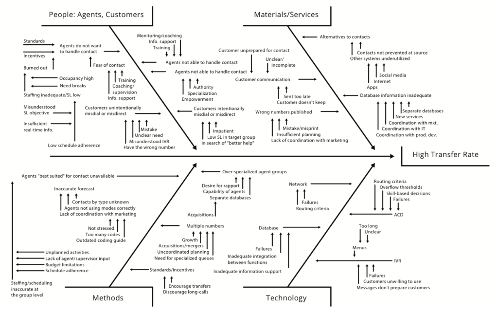
The cause-and-effect diagram, alternatively called a “fishbone diagram” (because of its shape) or Ishikawa diagram (after its creator, Dr. Kaoru Ishikawa), is recognized and used worldwide. It illustrates the relationships between causes and a specific effect you want to study. Preparing a cause-and-effect diagram is an education in itself, and everyone who participates will gain a better understanding of the process.
 Root Cause Analysis: Statistical
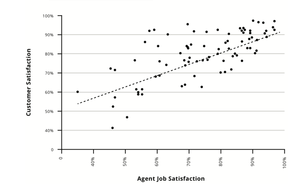
A scatter diagram assesses the strength of the relationship between two variables, and is used to test and document their possible cause and effect. The correlation between customer satisfaction and employee satisfaction is an example.
 The Pareto chart (named after its creator, Italian economist Vilfredo Pareto), ranks the events you are analyzing in order of importance or frequency. The Pareto principle (the source of the 80/20 rule) dictates that you should work first on the things that will yield the biggest improvements.
A control chart provides powerful insight on variation within a complex process. There are two major types of variation: special causes and common causes. A control chart enables you to bring a process under statistical control by eliminating the chaos of special causes. You can then work on the common causes by improving both the “system” and the whole process.
Benchmarking is the process of measuring your products, services and processes against those of other organizations. While many of these tools focus on improvements from within, the idea behind benchmarking is that breakthrough ideas often come from the outside (outside the organization and, often, outside your industry).
Small Improvements Lead to Big Returns
With any of these tools and methods, there is a danger of getting caught up in the analysis process itself and forgetting to move on to problem resolution. Once you’ve identified problems to tackle, assign responsibilities, provide necessary resources, and make the improvements. Then track progress.
Even seemingly small improvements can make a big difference. A government agency learned from employees that constituents (customers) were sharing information in a different way than the system was capturing data. The customer service team worked with IT to redesign the screens and data fields used during interactions. This cut the average time to handle interactions by 3% (which, with an average cost per contact of $9, was 27 cents per contact). Here’s the impact: with 620,000 annual contacts, the value of this improvement was $167,400 every year (3% × $9 × 620,000). The savings exceeded $1 million within six years. 27 cents! Yes, even small changes can really add up.
Note: This post is part of a series on Improving Quality and Performance in Customer Experience:
Principle #1: Quality Must Be Based on Customer Needs and Expectations
Principle #2: Quality and Access to Service Work Together
Principle #3: The Process Is Where the Leverage Is


0 Comments